
Luce Gallery is pleased to announce “Traveling Mercies”, the first solo show of Ryan Cosbert in Turin, from March 24 to April 23, 2022.
The young African-American painter of Haitian and Guyanese descent uses a tactile abstraction to communicate conceptual ideas deeply rooted in Black culture. The exhibition features twelve paintings characterized by a “tile” composition. Applying symbolic colors, texture, and objects, the artist conceives works that reference the consequences of subjugation and oppression of the Black community while often highlighting marginalized Black historical figures, communal experiences, or very held beliefs. The paintings seek to foster significant conversations that question the absence of these stories in our history while also exploring contemporary perspectives from Black individuals.
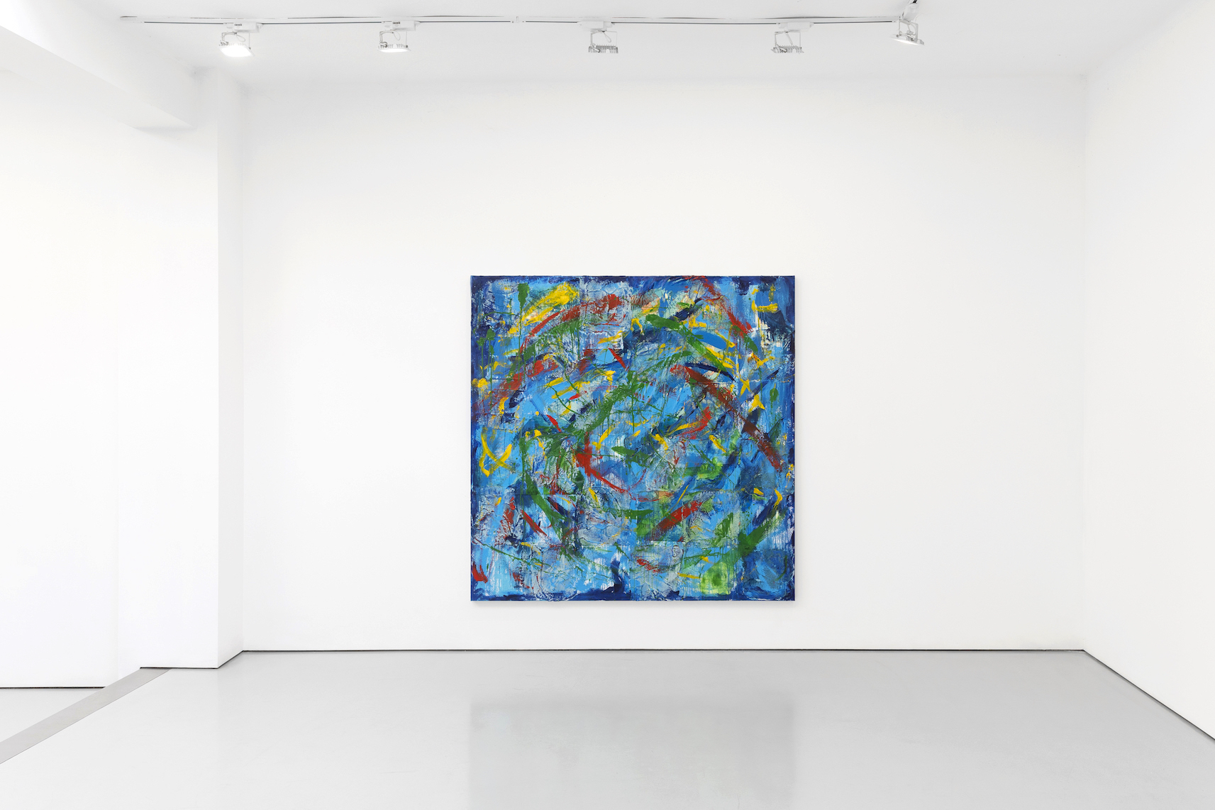
The title, Traveling Mercies, is an expression related to a type of Christian prayer said to protect travelers from the perils of travel, allowing them to arrive safely at their destination. This theme of requiring protection on a journey seems present in each painting. In keeping with her signature style, the “tiles'' are laid out in a checkerboard pattern along with thick textured brushstrokes and a palette imbued with meaning. The artist chose a collection of blues echoing the azure sky or cobalt ocean and hues of the Pan-African flag in red, green, yellow, and black implying the traveler, destination or origin. The energetic brushstrokes and use of bright colors draw the viewer in, while the grid-like composition hints at an underlying order and clarity of the message, revealed only in the titles. The strength of her work is how she has created a recognizable visual language using “tiles” and symbolic elements to express these highly-specific concepts drawn from her research and personal experience.
Fly High, Ode to Bessie Coleman (2022) resembles a cerulean sky filled with swirling white sky-writing and thick, white, cumulous-like “tiles” with gray undertones. Soaring in all directions, we see white paper airplanes, in varying sizes, attached to the surface of the painting. At the left of the composition, Cosbert paints a solid column of her grid in this thicker gray-white, almost to imply a storm brewing, like a wall of clouds rolling in.
Also, the artist hangs a beige rabbit foot charm on two of the paper planes, alluding to hopes of a successful journey. This well-known symbol of luck is a tradition that can be traced from enslaved African Americans back to African savanna folklore.
In Turin, from February 14 to March 14, 2022, Luce Gallery is pleased to present the solo show “One of These Days. One of These Days.” of Robert Davis.
“One of These Days. One of These Days.” is a newly created series of thirty intimately scaled watercolors. For these works, the American artist focuses on the “now”: a time that he defines as a reflection of the trauma, politics, social upheaval, and violence we are collectively enduring, and in so many different forms and times have always faced. Through the lens of both history and art history, his paintings intimate a transhistorical narrative that touches on the cycle of birth, death, and all struggles in between.
For his classically rendered work, Davis chose readily available imagery that spans popular culture and high art, images that are imbued with their own referential logic or, regardless of age, echo current realities. These include, among others: a classic rock album cover by Pink Floyd that is a homage to George Orwell‘s classic novel “Animal Farm”; a photograph of the killer Frankie Baker, who inspired the murder ballad “Frankie and Johnny” by Bill Dooley; old master paintings “Judith with the Head of Holofernes” by Cristofano Allori and “The Parable of the Blind” by Pieter Bruegel the Elder.
The notion of circularity in both the work and the exhibition title plays out more directly in pieces rendered multiple times: three of the same portrait of Marvin Gays, four versions of “Ophelia” after John Everett Millais, two paintings of the Grateful Dead’s iconic “skeleton”.
Davis’s style of appropriation might be understood as a kind of psychological exercise. His work’s reliance on repetition, returning, and revisiting implies a “working through” of a contemporary moment so burdened by its long history.
.jpg)
Luce Gallery is pleased to present Behold, Sun´s People, a solo exhibition of paintings by Barry Yusufu from January 13 – February 12, 2022.
Barry Yusufu, an artist living and working in Abuja, Nigeria, paints portraitures of people around him. He sees his brush as a tool to bring consciousness to the power of self and the collective greatness of Africans. With these tools, he aims to open a path for his people to rediscover the true essence of their being and the importance of defining beauty for themselves. The paintings of Barry Yusufu center around unearthing stories and identities lost to jaundiced history. His works seek to renarrate and memoir the African experience by personifying the apotheosis of his subjects.
The artist sees his approach as a design to reconcile years of stylistic arm-wrestling on the documentation of African history. Behold, Sun´s People brings a new reflection of his subjects which he approaches from a perspective nourished in royalty and god-likeness. He unmasks this narrative from the depths of misrepresentation and misinterpretation by skillfully painting his subjects with skins of bronze, an ode to African nobility. In the demeanor of an efficient painter with a melodious sense of duty, the artist deftly creates solid layers of oil on canvas seeking to immortalize and chronicle the existence of his people. Inspired by the reminiscence of the beauty and nobility of the African people, the Nigerian artist reimagines and creates representations of his people, exalting their heritage with brush strokes. In the exhibition, Barry Yusufu heralds a new consciousness on the visualization of Africans, strengthening the relevance of rediscovering their true essence.
To retell this story, there is a dire need for reflection, to reclaim parts of our collective consciousness that chroniclers failed to document. Barry uses his art as a medium to eliminate the opacity of the lens through which Africans are seen. This body of work is a bold proclamation of that. These paintings spotlight the glory of the African people and our buried histories, histories that needs to be retold. Barry Yusufu finds the mutuality between him and his subjects, using his brush and technique to paint them honestly, consciously avoiding perfection and stereotypical acceptance. He reveals the glory that societal constructs have beaten out of their minds by using these
bronzed portraits as archetypes, composite of many different histories merged to parse the evolution of African royalty and power as form. Six-Stars, which word-plays with sisters, is a series of six works that illustrates the lives of African women. It presents the subjects as standing before a burning furnace, the furnace being a metaphor for their struggle and a symbol of their revival, just like the phoenix. Date Night shows a lady who prioritizes her safety even when unwinding. This piece shows one of the many struggles of women. An Old Line Tale is a depiction of a traditional African matrimony, exceptionally respected and deeply rooted in community. Here, the artist portrays the man as a protector of his household and the woman as his partner. Finally, these works also draw influence from the historical depictions of African royalties and deities such as the Benin and Ife bronze sculptures.
History documents bronze as a significant element in Africa’s creative culture. These are the ones born of the sun, those whose skin shines like bronze, the children of the sun; Sun's People. Behold them!!!
(Avan-Nomayo Ikponmwosa)
.jpg)
We are pleased to announce, Progress of the Soul, the second solo exhibition for Dominic Chambers at Luce Gallery. Ten works of art — all related to self-portraiture — will be on view through December 22nd. Chambers is a New Haven-based painter and drawing artist working in a contemporary magical realism style. He creates portraits of friends and fellow artists that depict scenes of leisure or meditative practices, interwoven with symbolic references that address the interior self. Each painting generates a moment where Black individuals are shown in quiet contemplation and celebrated as deep thinkers. The works on view take an in-depth exploration into Chambers’ study of introspection, as the artist used himself as the subject in these paintings created during the Covid-19 lockdown. Progress of the Soul poses questions about how we attempt to understand ourselves during prolonged periods of isolation and explores the ways in which our activities become meditations, our memories become transportive, and our thoughts border on transcendental experiences.
In Progress of the Soul, Chambers artworks encourage the viewer to contemplate our sense of self in our everyday calm moments. This body of work depicts the artist alone engaged in various introspective activities including: reading, painting, gazing out a open window, or resting in an armchair. Each work explores our relationship to our thoughts and memories, and how we utilize them to grapple with our sense of self. The strength of Chambers’s work is how he elevates moments at rest using nuanced gestures of the body, and by blurring the lines between landscape and mindscape.
In his large diptych, The Warmth of Memory, Chambers employs a mostly red monochromatic palette to depict two distinct narratives in his double self-portrait. On the left, he’s seated in a grassy field with rolling Tuscan hills receding into the background. He portrays himself completely engrossed in writing or sketching in a book, seemingly unaware of his surreal surroundings. On the right, he stands before an oversized canvas, brush and palette in hand, capturing the hilly landscape. The painting reads like a continuous narrative presenting the artist in two distinct states of mind, preparation and execution, both with the same intensity of focus and concentration. The artist also incorporated symbols like birds, which he equates with freedom, and painted them in bold contrasting hues moving freely throughout the composition. TheWarmth of Memory is a seminal work for Chambers, as it documents his progression towards synthesizing the journey of soul searching with the architecture of memory.
Dominic Chambers is a New Haven-based artist originally from St. Louis, Missouri. He paints introspective scenes that illustrate both the interior and exterior self and how this duality co-exists using a bold vibrant palette. Chambers’ work draws on both historical and art historical references and is grounded in his experiences as a Black man. He received his BFA from the Milwaukee Institute of Art and Design in 2016 and later, graduated with an MFA from the Yale University School of Art in 2019. Chambers has exhibited widely both internationally and domestically, including most recently at the Philbrook Museum of Art, Tulsa, OK; the MIAD Contemporary Gallery, Milwaukee, WI; and the August Wilson African American Cultural Center, Pittsburgh, PA. He has also participated in a number of noteworthy residencies including the Yale Norfolk Summer Residency in New Haven, CT, and the New York Studio Residency Program in Brooklyn, NY. Additionally, his work has been acquired by numerous private and public collections including the Perez Art Museum in Miami, Florida and LACMA in Los Angeles, California.
.jpg)
Luce Gallery is pleased to announce Untouchable Negritude, the first solo exhibition at the Gallery by the Brazilian artist Zéh Palito. The new body of work it’s a presentation of a series of his classic subjects drawn from the artist’s culture and love for bright colors, relaxed and intense atmospheres. All paintings are displayed on similar sizes in a sort of repetition of the same exercise, where is visible the absence of a defined background in the represented scene, in the attempt to focus the attention of the main subjects. Also the palette of colors are repeated as some famous brands logos that refers to a popular folk culture. “Untouchable Negritude is a collection of works that showcase Blackness through the lens of Zéh Palito. Riddled with nuance, Palito provides insight to contemporary African Diasporic life by painting figures that exude satisfaction and self-assurance. Adorned with gold and other jewels, shells, exotic fruits, and flowers, each figure becomes the center of attention, thus allowing them to become the protagonist of their own story. Each figure is positioned in a stance of power that illustrates a positive self-identity and pays homage to a rich cultural heritage. Combined with the use of bright colors, each figure demonstrates confidence through their mere existence. Palito is a storyteller and cultural observer. This exhibition is a vehicle in which he is using to tell unique stories of the black experience.” Thomas James (curator)
“Zéh Palito’s Tropical Diaspora is like a cool inviting breeze rolling off of the ocean on a warm summer day. His vibrancy brings forth new perspective, love of self and others, and an appreciation of Blackness worldwide. Palito creates wildly vivid paintings that capture aspirational scenes and spaces full of life. They also depict the Black figure surrounded by nature, fantasy and objects associated with leisure, while keeping the environments and subjects in-tune with one another. The subjects, in their most honest manner, greet you both formally and contextually. These works are like a vintage hand painted commercial street sign of luxury goods, but the exchange is only cultural currency something you can’t buy. Palito’s vision of the future is juxtaposition with imagery from the past. The new image is one of confidence and excitement about the world he sees. Love and light coexist and are represented in the painterly expression and gesturing application found in the work. Familiar imagery has either been loosely painted or has become a motif with unfinished stretch markings, reminiscent of murals seen in various stages of production – an art form Palito is very familiar with. Derrick Adams
The works are one “Tropical Diaspora” where display imaginatively constructed narratives reflecting an atmospheric world of wonder and symbolism. There is much to consider as you explore the visual language and mythology in which these dynamisms are built up.
Luce Gallery is proud to present You Sea Us, Ludovic Nkoth’s first European solo show with the gallery.
In the artist’s native land – Cameroon – water is not only the symbol of life and rebirth, but it also represents how countless African migrants start their journeys to Europe in search of a better life all too often to find nothing but closed doors, hostility, and in the worst case death. The human rights situation of migrants and refugees at the Mediterranean sea is desperate, dangerous, and the numbers of lost lives at the hand of European authorities are unjustifiable and one of our century’s biggest tragedies. “My idea was to travel to Europe and create these works on European land to show them everything they are refusing to face in their own backyard. I lived in Spain for a couple of months during the pandemic because I wanted to experience what it would even feel like to walk around that part of the world as a migrant of color”, Nkoth explained.
The exhibition features six works on canvas portraying people forced to face the unknown. A large-scale painting “Lighthouse,” depicts a sinking boat, an image we are often confronted with daily, but this time, the viewer has to observe and contemplate these desperate scenes and therefore becomes part of it as a witness. Nkoth uses an array of mediums in this body of work, including wood masks that almost work as sculptures, works on paper, metal, shells, sand, fishing rods, and more. He uses raw materials such as sand to evoke different dimensions – literally but also on a deeper spiritual level.
Throughout the show, Nkoth thoughtfully waves in different symbols such as shells, passengers, and fallen angels as part of a complex and personal investigation of the African continent that suggest a sense of depth and discovery. Shells were traditionally used as currency and are also associated with the spirits of the water. Here Nkoth uses them to represent the bodies that were lost at sea.
The painting “Do They Hold Me Down” is a self-portrait, and the shadow coming through the body stands for all those souls lost in the Mediterranean sea. According to Nkoth those “fallen angels” who were once on that same trajectory are now returning to protect new passengers through this horrifying experience and to guide them to the shore safely. The show’s centerpiece, “The Gates Of No Return,” in which Nkoth depicts the menacing routes asylum seekers are forced to take given the lack of legal paths to enter Europe. In the piece “The Light In Me” Nkoth explores the relationship between black bodies and water more joyfully and positively as a counterpoint to current narratives.
"The paintings in Constellations I drew in Nevada emerged from drawings I made of the night sky during an artist residency in the Great Basin Desert (in rural Nevada) in 2019.
I did not have access to the internet or phone service, so the clusters I drew were stars I imagined to be in relation to one another, rather than mythological or historical groupings. Everywhere in the Great Basin is a scattering of stone, of petrified wood, of bleached animal bones.
The sculptures of stone and glass throughout this exhibition relate to the desert ground, the paintings to the night sky.The following is a diary entry from that time: August 29th, 2020, The Montello Foundation, NevadaQuite an eventful night last night. A windstorm blew though this stretch of basin rattling the house and making a significant racket. The anxiety of the night made me quite sure it would blow the wildfires right to my door. But it the morning, everything was as it was. This morning, virga, all around.
I can’t remember- is sepulcher the smell of rain before it comes? I’ve been thinking a lot about beauty, what it is, how it translates into physical form. I feel most beautiful when I soften, let go of expectations, let go of the rigid boundary between myself and the world. The most beautiful things, I believe, can appear to be ugly with only a short twist of light. I think this is because they are a responsive to, intertwined with the world they breath in. In the desert one’s boundaries dissolve. Loneliness is not so much of an issue because one becomes also dust, also light. Everything passes through you all the time. High altitude deserts near mountains- this is my home.
How can I construct a life where I can always come back here? Here, I confuse my heartbeat with the sound of an approaching truck. I collect rocks and they slip through my overladen hands- everywhere a treasure. The counters of mountains are like the curves and dips of a body- the grasses droop and leave semi-circle drawings when the wind blows them. A desert of brutality is not the desert that I have known. Yesterday, I saw a square rainbow held in a pocket of a cloud. I made dye from juniper berries and an old mordant recipe using juniper needle ash. I sat with what I didn’t know. I drew constellations in the sky and looked for their counterparts in the holes dug by insects and animals in the ground.
I find myself more and more trusting the land, listening to the wind. I rub sage between my hands and breath in. The words from John Steinbeck’s Travels with Charley play over and over again in my head- “the desert has mothered magical things”. When I dream, I dream of people When I dream, I dream of people I have known."

Thus clay, so lately no more than a crude and formless substance, was metamorphosed to assume the strange new figure of Man.
"The unknown,” said Faxe’s soft voice in the forest, “the unforetold, the unproven, that is what life is based on. Ignorance is the ground of thought. Unproof is the ground of action. If it were proven that there is no God there would be no religion…. But also if it were proven that there is a God there would be no religion…Tell me Genry, what is known?
I’d like to learn how to tell you your future in a way that does not deny your flexibility.
I love Ovid’s Metamorphoses- one story of change flowing to another- because I feel viscerally the looseness of the threads holding together our current forms.
Such as: I am a woman, now I am a spider, now a myth.
If Lucretius’s world is composed of unalterable atom’s, Ovid’s is composed of the qualities, attributes, and forms that reveal the distinctiveness of every object, and plant and animal and person but that are merely thin sheaths over a common substance which--- when stirred by profound emotion can change itself into radically different forms.
I work with wool, silk, metal, and dye because I’m interested in the fluidity (live-ness) of these materials.
The wool in my pieces is handspun, woven, boiled, and beaten. Touch, labor, and the imprint of my body becomes as present as possible.
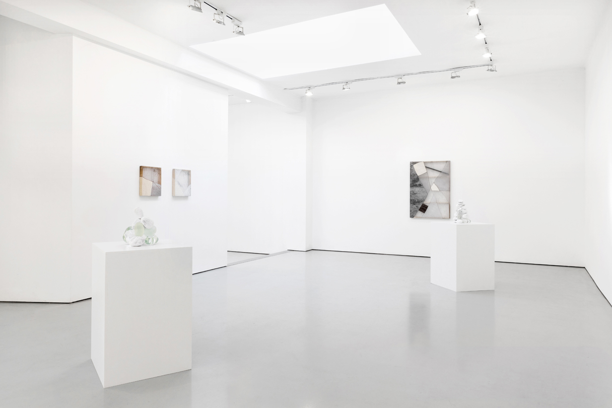
This exhibition includes both stretched and un-stretched works, all walking the line between painting and textile. I see the relationship between my stretched and free-hanging works as similar to how I understand stillness against motion, silence next to sound. Separate entities, yet capable of forming a rhythm (relationship) when sharing space. Oracles also includes a multipiece installation of stones, some gathered, some cast from steel. At its core, my practice is rooted in exploring transformation- how fostering attention to shift can be not only a creative practice, but also a spiritual, even a devotional one.
To cast the dice when the future is a moving target. What is divination in the face of unrelenting transformation? If nothing is fixed, then known and unknown. At what point do we give up any distinction?
None of the elements kept their shape, and all were in conflict inside one body: the cold with the hot, the wet with the dry, the soft with the hard, and the weight with the weightless.Like before we were born, or inside a black hole, or within a moment of extreme exhaustion.
Stones into steel. Fleece into fabric. What am I in this instant? I’m a typewriter making the dry echo in the dark, humid dawn.
The gallery is pleased to start the new season with a group show organized in the new gallery space at Largo Montebello 40.
The show, titled “No Evidence of Sign,” focuses on the lack of a pictorial sign in the strict sense of the term. The artists, though very different from one another, share an approach and a technique – in spite of their great variety – that differs from the classic, canonical definition of painting.
The four artists, however, seem to share in the creation of a single atmosphere. The scenes represented and the use of colors, though in different media, are brought together in terms of the light that reflects on the paintings and sculptures, generating a homogeneous effect in the installation.
All the artists apply a process of transfer of the image that draws the viewer into a shared imaginary, often with autobiographical narrative references.
For Margo Wolowiec the images are found on the web, and subjected to a process of hand embroidery, becoming subjects without precise definition, like blurry stop-action film frames.
The allegorical paintings of Chris Hood are based on a process of transfer of the paint from behind the canvas, pushed through its “weave” and emerging like a subtle grille, echoing the classic techniques used for the back-painting of glass.
Hugo McCloud, who has recently produced a series titled “veiled,” through a screen of metallic colors and the use of industrial materials creates paintings that have the feel of bas reliefs, inverting the techniques utilized between painting and sculpture, making the two media suggest each other.
For Stephan Balkenhol the filter is the wood itself, again to create paintings as bas reliefs or in three dimensions, through the use of a single piece of wood that is sculpted and then painted.
BIO
Stephan Balkenhol was born in Fritzlar/Hessen in 1957. Lives and works in Karlsruhe,Germany and Meisenthal, France. Selected solo shows: Moscow Museale of Moderna Art, Calais Togolesi; Galleria Monica De Cardenas, Milan; Galerie Rüdiger Schöttle, Munich; Stephen Friedman Gallery, London; Galerie Thaddaeus Ropac, Salzburg; “Big Head Column”, Peggy Guggenheim Collection, Venice; Luce Gallery, Turin.
Chris Hood was born in Atlanta in 1984. Lives and works in Los Angeles. Selected solo shows: Lyles & King, New York; “Octopi Blush”, MIER Gallery, Los Angeles; Bad Skin, Galerie Bernard Ceysson, Paris.
Hugo McCloud was born in Palo Alto in 1980. Lives and works in Brooklyn, New York. Selected solo shows: “Veiled”, Sean Kelly Gallery, New York; “Timeline”, Fondazione 107, Turin; The Arts Club, London; “Palindrome”, Sean Kelly, New York; “Muted Noise”, Luce Gallery, Turin.
Margo Wolowiec was born in Detroit in 1985. Lives and works in Detroit. Selected solo shows: “Evergreen, Searchlight, Rosebud”, Jessica Silverman Gallery, San Francisco;“Summer Learning Loss”, Laura Bartlett Gallery, London; “Double Blind”, Anat Ebgi, Los Angeles; “Corrections and Exposures”, Lisa Cooley, New York; “Margo Wolowiec”, Anat Ebgi, Los Angeles.
.jpg)
Luce Gallery presents Agency & Regulation, an exhibition of paintings, collages and sculpture by Derek Fordjour, opening October 7th, 2016.Agency & Regulation is an exploration of the tension that arises from the intersection of two potentially oppositional forces: agency; the capacity to move independently while exerting direct control over one’s own behavior, and regulation; an authoritative rule or system of rules dealing with restricting details or procedure.Theories of agency and regulation both separately emerge primarily from the field of economics. While Regulation Theory hinges on formulations of self-regulation, Agency Theory is chiefly concerned with conflicts of interest between people with different interests in the same asset. Fordjour’s interests lie within the sociological motivations embedded within these theoretical assumptions. For the individual, questions of free will, personal freedom and the successive interaction with institutional structures, entrenched social hierarchies and authoritarian bodies establish the basis of his inquiry.The gamifcation of social structures and the inherent vulnerability of the individual situated within a contest are recurring themes within Fordjour’s work. The origins of these concepts are an outgrowth of the artist’s own bodily experience of motility while pondering recent social unrest. The allegorical relationship between art and sports provides philosophical context for his musings. Through the use of game and sporting imagery, lotteries, backroom meetings, game piece inspired sculptural objects, Fordjour implores a haptic exploration of personal, artistic and cultural concerns through various media.For the artist, his work is “fundamentally concerned with an exploration of vulnerability. As both an artist and marginalized person in society, I am keenly aware of my sense of agency. Much akin to the plight of a player situated within an individual or collective game, knowledge of the rules, the acquisition and development of skill and an adept application of both are critical to one’s survival."Working primarily in three media: sculpture, painting and collage, Agency & Regulation is also a material exploration. The sculptural works that appear in the show are constructed using bituminous coal crushed by the artist’s hand. Fordjour has spent the past several years working with coal, due in large part to emblematic associations of labor, extraction and value. Now, Fordjour presents his most ambitious coal sculptures to date. Collage works are the result of meticulous accumulation of numerous layers of newspaper, and a marriage of printmaking and painting processes resulting in highly textured one of a kind surface. What remains is evidence of both constructive and destructive acts reminiscent of the architectural interiors of Fordjour’s youth in Memphis, marked with the experience of inhabiting second-hand schools and churches in the aftermath of white flight.Paintings in the exhibition implore the use of spatial flattening reminiscent of modernist figuration to explore themes of agency and regulation. Equally concerned with such notions are sculptures such as Topdog, a playfully inverted totemic stack of coal covered busts assembled in a precarious vertical configuration. Topdog exemplifies the balance of play,uncertainty and possibility that underscore this significant body of work.Derek Fordjour was born in Memphis, Tennessee to parents of Ghanaian heritage. He is a graduate of Morehouse College in Atlanta Georgia, earned a Master’s Degree in Art Education from Harvard University and an MFA in painting from Hunter College. His work has appeared in group shows at Roberts & Tilton Gallery in Los Angeles, Sotheby's S2 Gallery in New York. His work has been reviewed in the New York Times, Los Angeles Times, Huffington Post and Brooklyn Rail. His work appears in several collections throughout the US and Europe. He is the 2016-2017 Artist-in-Residence at Sugar Hill Museum in New York City.
.jpg)
"I've seen Avocado trees weighed down with so many fruit that some ripen right on the ground. The whole tree is pulled taut by its harvest and when it rains branches break. It's not stressful, it feels full and healthy and right. I've seen whole banana trees fold in half under the weight of their own crop. The heart of a banana tree is like a bunch of paper straws filled with liquid and it kinks and bends easily unless you prop it up with something. It doesn't matter what it is. People make supports out of scraps of 2x4, broom sticks or old folding chairs. Inevitably, the thing that is used to prop up the tree, begins to feel alive. After the hummingbirds have come and the bananas have ripened and gone, people regularly leave the prop against the tree. It acknowledges both an expired event and an inevitable future. Often, so much depends on so little".
Alex Chitty, born in 1979 in Miami, is an interdisciplinary artist based in Chicago.
In Slight Pitch, Chitty's work relies on specific points of tension. Entire surfaces are held in place by those points. It's simple to imagine a piece dissolving right there in front of you. You can basically take apart the whole thing in your head. Once you trace out the steps and resolve the completed picture in your mind, the softest shift could cause the whole thing to slip apart.
While her portfolio ranges from photographic prints to sculpture, her current practice invites viewers to question both the materiality and presentation of an object. Chitty received a Bachelor of Fine Art from Smith College (MA) and a Master in Fine Arts from the School of the Art Institute of Chicago where she is a professor in the Sculpture and Printmedia departments. This year she had a solo shows at Patron Gallery and at Hyde Park Art Center in Chicago. In 2015 she exposed at Shane Campbell Gallery in Chicago.
.jpg)
In Stations Young continues his investigation into a series of diagrammatic marks originally abstracted from two sources; his fathers theological notations and explanations of the sign in Ferdinand de Sasussure’s semiotic theory. The potential that the forms could have meaning rests in the aesthetic of the diagram as an authoritative mark. Operating as frame-works for latent ideas, the works invite the viewer to project meaning onto them but rather than provide the significance the work leaves to viewer to question why it is that implication may have been possible in the first place. In this way the works operate as empty containers or possibilities as opposed to articulations filled with dogma or truth.
In this installation Young uses the 14 stations of the cross as a starting point to push the work further toward its religious reference while at the same time disrupting the ability to land on a particular doctrine. The stations serve not as an animation of the original story line, the trail and death of Christ, but as a method to move the audience through space. Although no actual narrative occurs, the serial nature and linear structure produces an implication of logic suggesting an ideology that remains hidden.
Nate Young, born in 1981, lives and works in Minneapolis, MN.
Selected solo shows: The Unseen Evidence of Things Substantiated, The Fabric Workshop and Museum, Philadelphia, PA; But not yet: in the spirit of linguistics, Monique Meloche, Chicago, IL; Rehearsals, Bethel University, Arden Hills, MN; Tony Lewis and Nate Young, Room East, New York, NY; Joy, The Suburban, Oak Park, IL.
Selected group shows: Retreat (curated by Theaster Gates), Richard Gray Gallery, Chicago, IL; Jerome Fellows Exhibition, Mpls. College of Art and Design, Minneapolis, MN; Fore, Studio Museum in Harlem, New York, NY; Go Tell it on the Mountain, California African Am Museum, Los Angeles, CA; Body Word and Image, Drake University, Des Moines, IA; Anthology (Participant), PS1 MOMA, New York, NY.
.svg)


